Contrasting cabinet colors have become one of the most popular design choices in modern kitchen renovations. Instead of using a single uniform tone throughout the space, homeowners are now mixing colors to create depth, personality, and a more dynamic visual experience. When done thoughtfully, this approach can completely transform the feel of a kitchen without requiring major structural changes.
In areas like Dublin, Columbus, OH, homeowners are increasingly embracing two-tone cabinetry as part of both new builds and remodeling projects. The goal is no longer just storage—it’s about creating a balanced, stylish environment that reflects personal taste while remaining functional for everyday living. Whether pairing soft neutrals with bold accents or blending natural wood tones with painted finishes, contrast in cabinetry design continues to grow in popularity.
Why Contrasting Cabinet Colors Work in Kitchen Design
Color contrast in cabinetry is more than just a trend. It is a design strategy that helps shape how a kitchen feels and functions.
Creating Visual Interest
A single-color kitchen can sometimes feel flat or one-dimensional, especially in larger spaces. By introducing contrasting tones, homeowners can break up large cabinet surfaces and add visual rhythm to the room.
This layering effect draws the eye naturally across the space, making the kitchen feel more engaging and thoughtfully designed.
Enhancing Kitchen Layout Perception
Contrasting colors can also influence how a kitchen’s size and layout are perceived. Lighter tones can open up a space, while darker shades ground it and create structure.
In smaller kitchens, this technique can make the room feel more spacious. In larger kitchens, it helps define zones and prevent the design from feeling too empty or disconnected.
Improving Overall Design Balance
A well-balanced kitchen often blends multiple elements—cabinets, countertops, flooring, and lighting. Using contrasting cabinet colors helps tie these components together.
When carefully coordinated, contrast creates harmony rather than conflict, resulting in a kitchen that feels cohesive and intentional.
Popular Cabinet Color Combination Styles
There are several tried-and-true combinations that homeowners frequently use when designing kitchens with contrasting cabinetry.
Light Upper Cabinets with Dark Lower Cabinets
One of the most common approaches is pairing light upper cabinets with darker base cabinets. This combination creates a natural visual balance, with lighter tones keeping the space open and darker tones anchoring the design.
This style works especially well in modern kitchens where simplicity and contrast are key design goals.
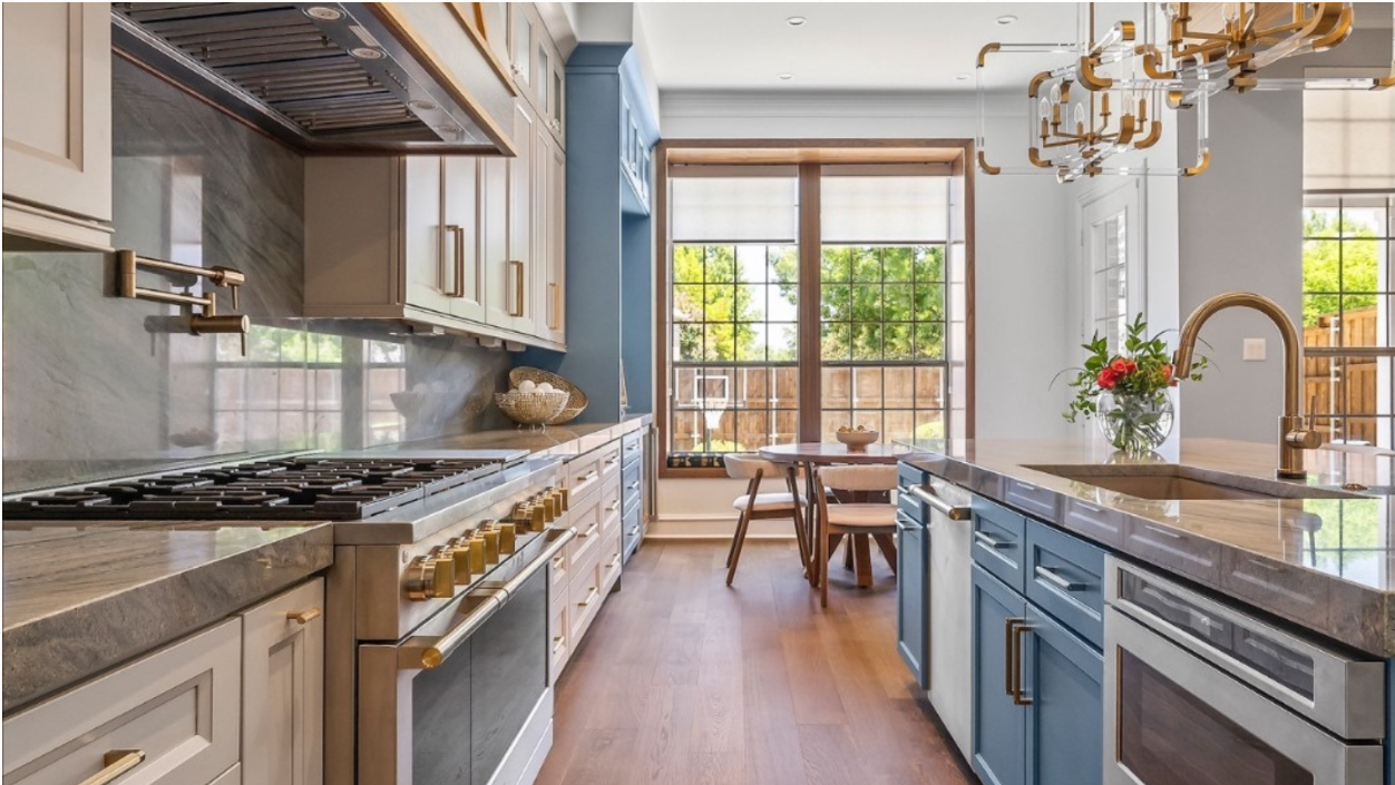
Neutral Cabinets with Bold Accent Colors
Another popular method is using neutral tones as a foundation while introducing bold colors in specific areas such as kitchen islands or lower cabinetry.
For example, soft whites or grays can be paired with deep navy, forest green, or charcoal accents to create a striking yet controlled contrast.
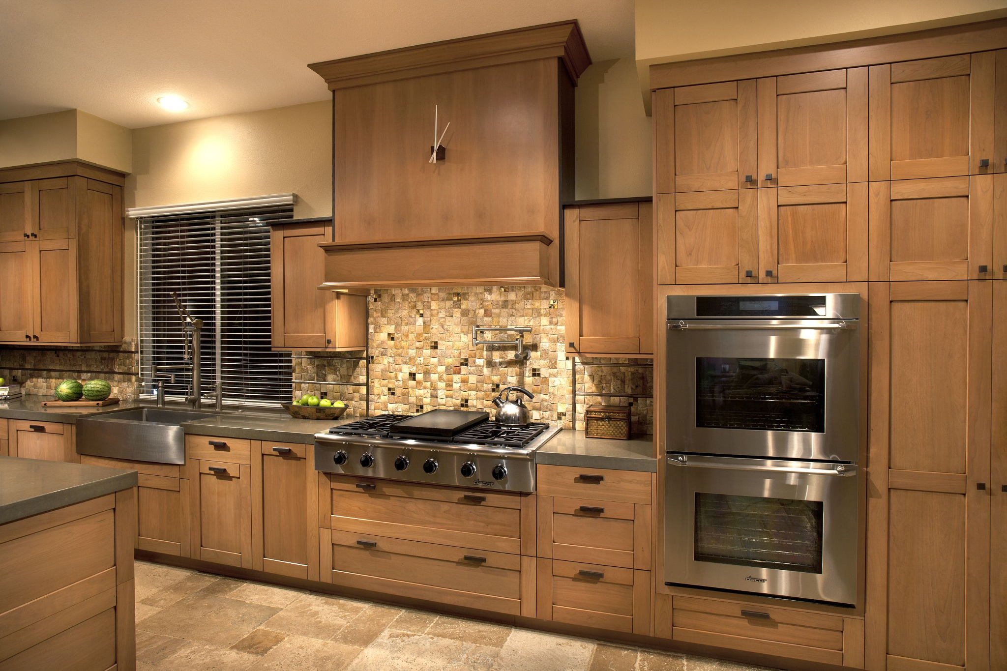
Natural Wood with Painted Finishes
Blending natural wood with painted cabinetry is a timeless approach that continues to evolve in modern design. The warmth of wood softens the clean look of painted surfaces, creating a balanced and inviting atmosphere.
In many homes, especially those featuring modern brown shaker cabinets, this combination brings a sense of warmth while still maintaining a contemporary feel.
Monochrome Variations
Not all contrasting designs rely on dramatic differences. Some kitchens use subtle variations within the same color family.
For example, pairing light gray with charcoal or cream with soft beige creates a gentle contrast that feels sophisticated without being overwhelming.
Smart Ways to Combine Cabinet Colors
Thoughtful planning is essential when working with multiple cabinet colors. The goal is to create harmony rather than visual confusion.
Using Kitchen Islands as a Color Focal Point
Kitchen islands are often used as the centerpiece of a contrasting color scheme. By painting or finishing the island in a different tone than the surrounding cabinets, homeowners can create a natural focal point.
This approach is particularly effective in open-concept homes where the kitchen flows into living areas.
Pairing Cabinets with Countertops and Backsplashes
Cabinet colors should always be considered alongside countertops and backsplash materials. These surfaces interact closely and influence the overall look of the kitchen.
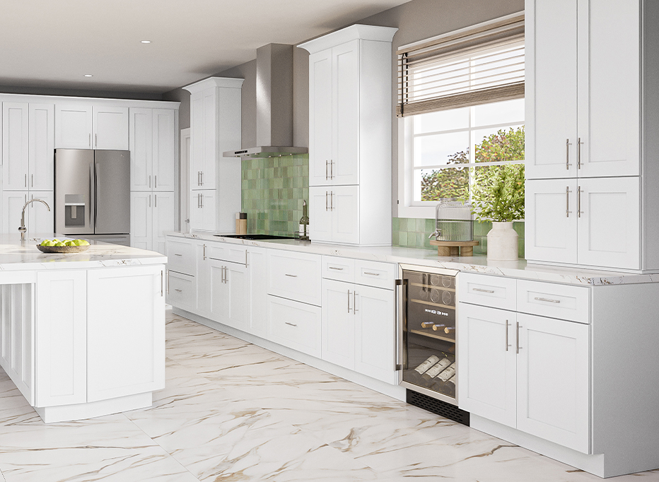
For example, pairing warm wood tones with light stone countertops or sleek white surfaces can create a balanced and visually appealing combination. Many homeowners exploring white cabinetry for kitchens find that it serves as a versatile base for a wide range of accent colors.
Balancing Warm and Cool Tones
A successful kitchen design often blends warm and cool tones in a controlled way. Warm wood finishes can be paired with cooler grays or whites to create contrast without visual tension.
This balance helps the kitchen feel both inviting and modern at the same time.
Highlighting Architectural Features
Color contrast can also be used to emphasize specific architectural elements in the kitchen. For example, a darker cabinet color can highlight a cooking zone, while lighter tones can define storage areas.
This technique helps organize the space visually while improving functionality.
Choosing the Right Cabinet Colors for Your Kitchen
Selecting the right color combination depends on several practical and aesthetic factors.
Considering Natural Light
Lighting plays a major role in how cabinet colors appear. A shade that looks soft and warm in bright natural light may appear darker in low-light conditions.
Homeowners in Dublin and Columbus often take lighting conditions into account before finalizing cabinet finishes to ensure consistent results throughout the day.
Matching Home Interior Style
Cabinet color choices should align with the overall design style of the home.
Modern kitchens often favor high contrast and clean lines, while traditional spaces may use softer, more blended tones. Transitional designs often combine both approaches for a balanced look.
Considering Kitchen Size
Color contrast can influence how large or small a kitchen feels.
Lighter tones tend to open up smaller kitchens, while darker accents can add depth and structure to larger spaces. Choosing the right balance ensures the kitchen feels comfortable and proportionate.
Coordinating with Flooring and Walls
Cabinet colors should not be selected in isolation. Flooring, wall paint, and countertops all contribute to the final design outcome.
A coordinated palette ensures that all elements work together rather than competing for attention.
Design Mistakes to Avoid
Even well-intentioned designs can fall short if certain mistakes are made.
Overusing Too Many Colors
Introducing too many colors can make a kitchen feel chaotic. A limited and well-planned palette is usually more effective.
Ignoring Undertones
Color undertones matter just as much as the main shade. Mixing warm and cool undertones without planning can lead to visual imbalance.
Creating Harsh Contrast Without Balance
While contrast is important, overly sharp differences between colors can feel jarring. A gradual transition or complementary tones often work better.
Forgetting Long-Term Appeal
Trendy colors may look appealing now but could feel outdated in a few years. Timeless combinations tend to provide better long-term satisfaction.
Practical Tips for a Balanced Kitchen Design
Start with a Neutral Base
Neutral tones such as white, gray, or soft beige often serve as a strong foundation for layered color schemes.
They allow flexibility when adding accent colors later.
Use Contrast Strategically
Instead of applying contrast everywhere, it is often more effective to highlight specific areas like islands or base cabinets.
Test Samples Before Finalizing
Viewing samples under different lighting conditions helps prevent unexpected color shifts once installation is complete.
Work with Design Professionals
Experienced designers and cabinet specialists in Dublin and Columbus can help refine color choices and ensure a cohesive final result. Local expertise is especially valuable when working with custom finishes or combinations like modern brown shaker cabinets paired with lighter accents.
Conclusion
Combining contrasting cabinet colors is a powerful way to elevate kitchen design without requiring major structural changes. When planned carefully, it enhances visual interest, improves layout perception, and creates a balanced and inviting space.
For homeowners in Dublin, Columbus, OH, thoughtful color selection whether incorporating white cabinetry for kitchens or richer wood tones can transform everyday cooking spaces into stylish, functional environments. The key is balance, coordination, and choosing combinations that feel both personal and timeless.